Bellevue Youth Choirs
Website Redesign & Enrollment Growth
Bellevue Youth Choirs (BYC) offers six choir programs for singers from preschool through age 24, each with its own dedicated page — Prelude, Prima, Intermezzo, Lyrica, Cantare, and Voce. About a year and a half after the site's initial redesign launched, I returned to these pages for a second pass, this time guided by real-world feedback rather than assumptions.
The first redesign had already delivered strong results: registrations increased by 200% following launch. But a year and a half of parents actually using the site surfaced a handful of specific, fixable gaps, and the Choir Director and Board had feature requests of their own. This case study covers that second round of changes.
Goals & Process
Rather than starting from a blank slate, I treated this as a targeted refinement. I gathered input from three sources: direct feedback from parents navigating registration, feature requests from the Choir Director around showcasing performances, and priorities from the Board about clarity and accessibility of program information.
The throughline across all of it was the same: help parents find what they need quickly, give them a better feel for the choir experience before they commit, and make sure nothing important gets missed along the way.
Key Changes
Hero Section
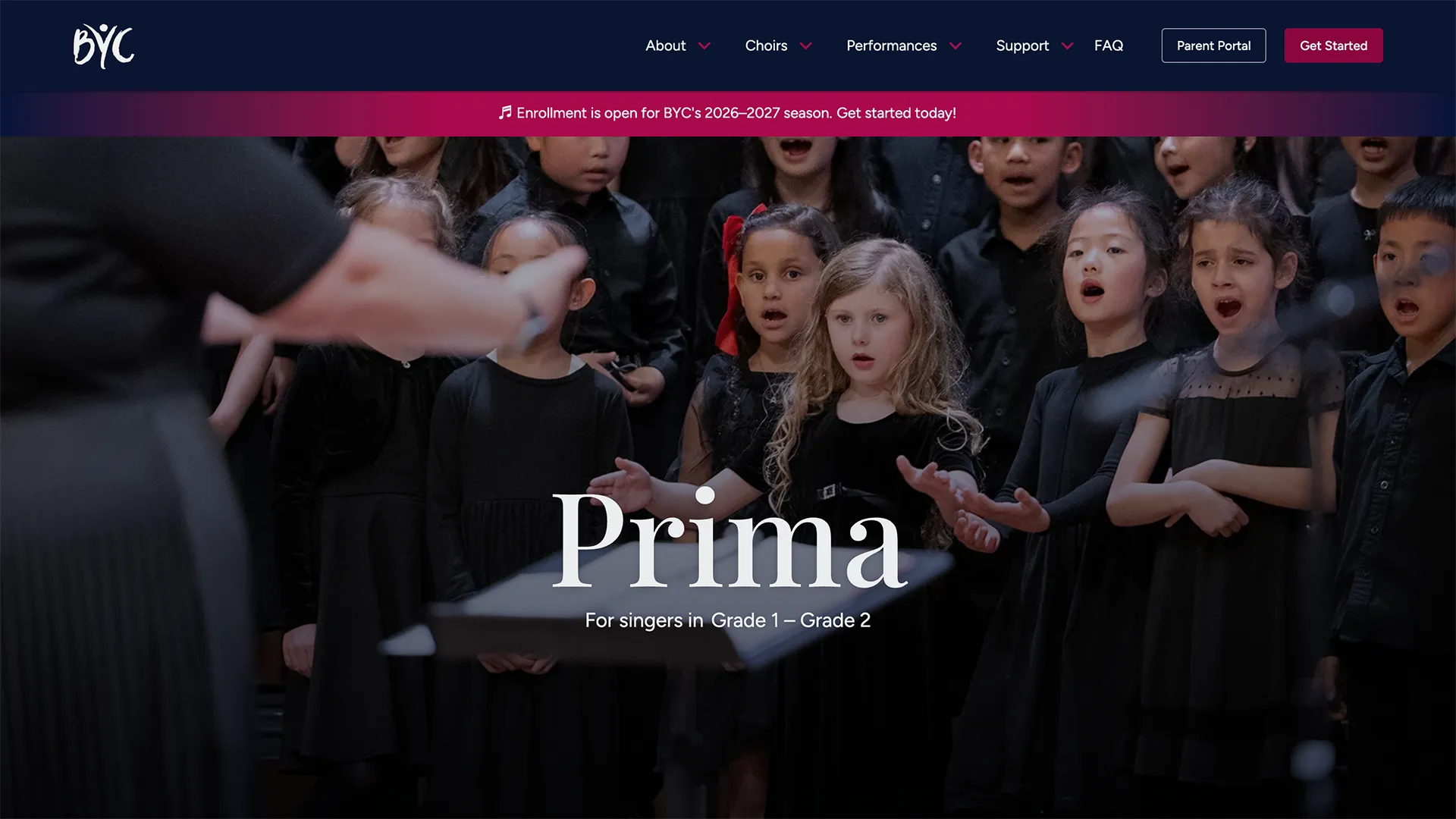
The original request called for a slideshow of images. In practice, cycling through multiple photos diluted the impact of any single one — visitors rarely stayed on a slide long enough for it to land. This was one of the few places I pushed back on the initial brief: rather than build the slideshow as requested, I made the case for a single, large, eye-catching hero image per choir, chosen to be immediately engaging and representative of that program's personality. A strong first impression mattered more here than variety.
Joining Section
Important logistical notes — enrollment windows, whether vocal placement is required, how tuition is billed — were originally buried within the Details section, and parents were missing them. This was fundamentally an information-hierarchy problem: the details parents needed most before registering were competing for attention with everything else on the page. I pulled these notes into their own dedicated “Joining” section with a bright pink background, so the highest-priority information is impossible to miss rather than something a parent has to hunt for.
About Section
The page overall skewed dark and dense. I lightened the backgrounds across several sections to open up the layout and better reflect BYC's warm, joyful tone — the goal was a page that feels as welcoming as the choirs themselves.
Details & Options Section
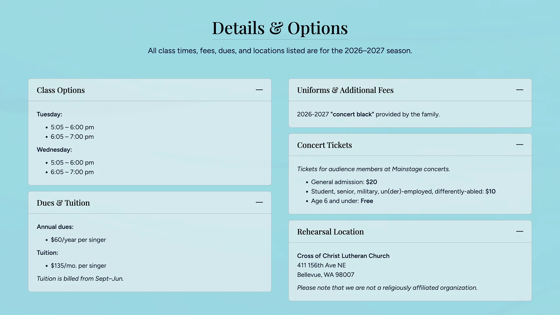
I condensed and reorganized this section so tuition, class times, location, and fees are exactly where a parent expects to look for them, with far less scanning required. Looking ahead, we also plan to add a downloadable handbook PDF, giving parents the same information in an offline-friendly format they can reference anytime.
Gallery
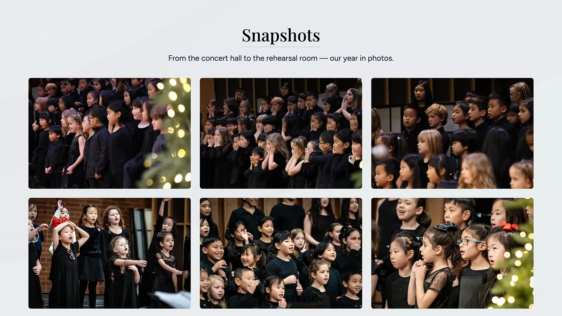
I added a photo gallery grid — “Snapshots” — to each choir page, pulling back the curtain on rehearsals and performances. It gives prospective parents a genuine sense of their kids in action before they ever attend a rehearsal.
YouTube Playlist
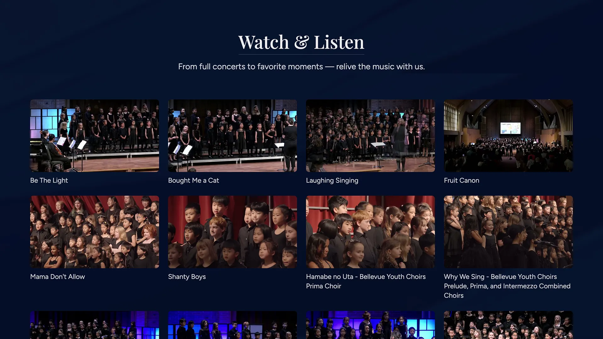
With six choirs and years of performance footage, manually curating and updating a relevant playlist for each program page wasn't sustainable. Using Cloudflare Workers, I built a system that automatically curates and serves a custom performance playlist for each individual choir, so visitors to a given program's page see performances relevant to that choir rather than a generic, one-size-fits-all video feed. Because the system is automated rather than hand-built per page, it's reusable — it can absorb new performances or even new choirs going forward without additional manual setup.
Results
The original redesign's 200% lift in registrations set a high bar, and this round of changes was built directly from the friction points that emerged after that launch — the notes parents missed, the slideshow that undersold the imagery, the details that took too long to find. The original 200% figure reflects the impact of that first redesign; the goal for this round is a second, additive data point that shows continued improvement rather than a plateau. Results specific to this second round are åstill coming in as the current enrollment season plays out, and I'll be tracking registration completion, time-on-page, and direct parent feedback to measure impact.
Looking Ahead
- Launch the downloadable handbook PDF for offline access to tuition, schedule, and policy details.
- Continue monitoring parent feedback each enrollment cycle to catch new friction points early.
- Extend the custom YouTube playlist system to highlight seasonal and outreach performances as they're added.